My Adventures With Superman makes one subtle design change to the classic Superman logo, which ironically emphasizes the character’s true meaning.
The Superman logo in My Adventures With Superman underwent one minor design change which further enhanced the character’s thematic meaning. The new animated series, which draws equally upon the classic Superman mythology and anime tropes for its unique aesthetic, has made several small changes from the traditional Superman story for the sake of diversity and realism. However, the changes to the Superman logo were reportedly 𝐛𝐨𝐫𝐧 of a desire on the part of the production team to emphasize a key trait of Superman’s character.
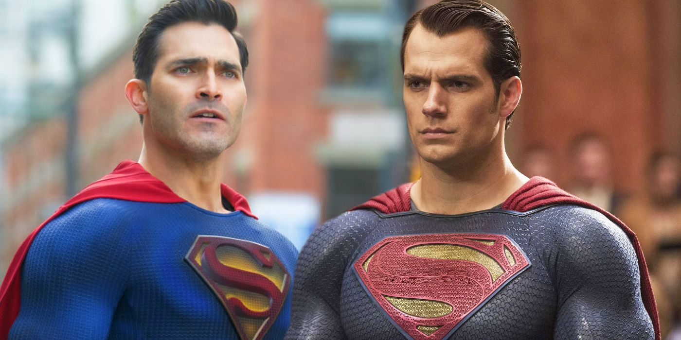
The precise meaning of Superman’s logo has changed dramatically over the years. Originally a simple “S” for Superman, the distinctive diamond design became the family crest of the House of El based on a suggestion from actor Marlon Brando during the filming of 1978’s Superman: The Movie. This explanation made its way into the comics, where writer Mark Waid introduced the idea of the logo being the Kryptonian symbol for “hope” in 2004’s Superman: Birthright. Geoff Johns later enscrolled both explanations as canon in 2009’s Superman: Secret Origin. However, despite these changes in meaning, the actual Superman logo design has changed relatively little over the years.
Superman’s New Logo & Costume Fit What Superman Represents
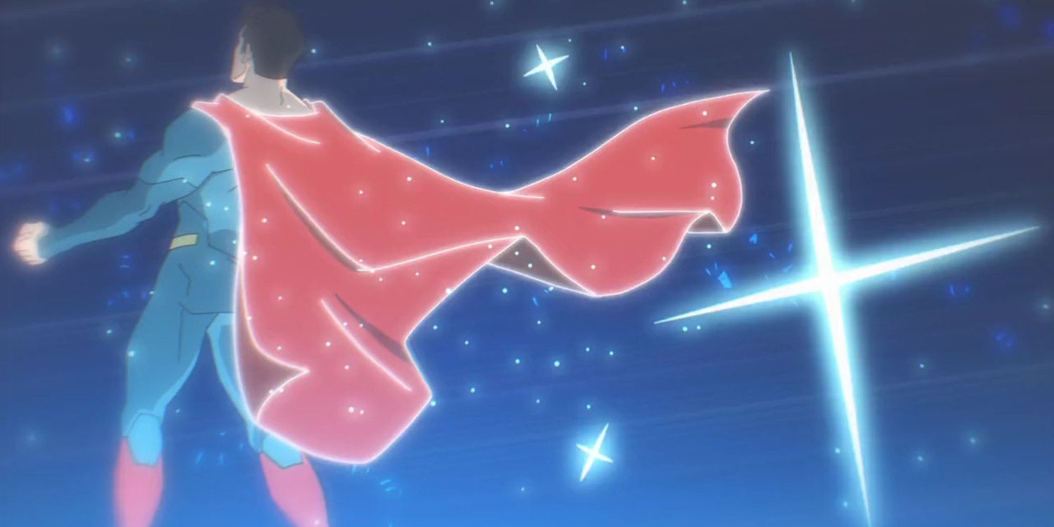
The Superman logo in My Adventures With Superman is sharper and more angular, contrasting with the soft curves of the classic design. This makes it look less like a familiar “S” shape and more alien in nature. It also emphasizes the harshness of the Kryptonian culture, which has been shown to be fascist, isolationist and xenophobic in different interpretations. This subtly backs a young Clark Kent’s rejection of his alien heritage, after he has a frightening encounter with a hologram of Jor-El while exploring the ship that brought him to Earth.
This drives home a key point regarding Superman’s core character across all media. While Superman looks human, he is an alien. Paradoxically, he is driven by human emotions and chooses to live the life of an ordinary human, rather than setting himself up as a ruler or a god. Many interpretations, like the DCEU Superman, falter in trying to emphasize Superman’s nature as an outsider and his feelings of alienation from humanity. This idea doesn’t mesh with Superman’s history, however, as the revelation that he is an alien did nothing to change who Clark Kent is or alter the values taught to him by Jonathan and Martha Kent.
My Adventures With Superman honors this history while also emphasizing the duality of Clark Kent’s identity through his costume. Clark acquires his famous super-suit in the second-half of the My Adventures With Superman premiere, after reluctantly confronting the Jor-El hologram. The suit, which resembles the trunkless armor of the New 52 Superman, prompts Martha Kent to declare that the outfit needs something to set it off, like a belt or shorts. This serves both to soften the harsh appearance of the Kryptonian garb and makes the costume into a merger of Kryptonian and human fashion, reflecting Clark’s conflicting identities.
Why My Adventures With Superman Changed Superman’s Logo
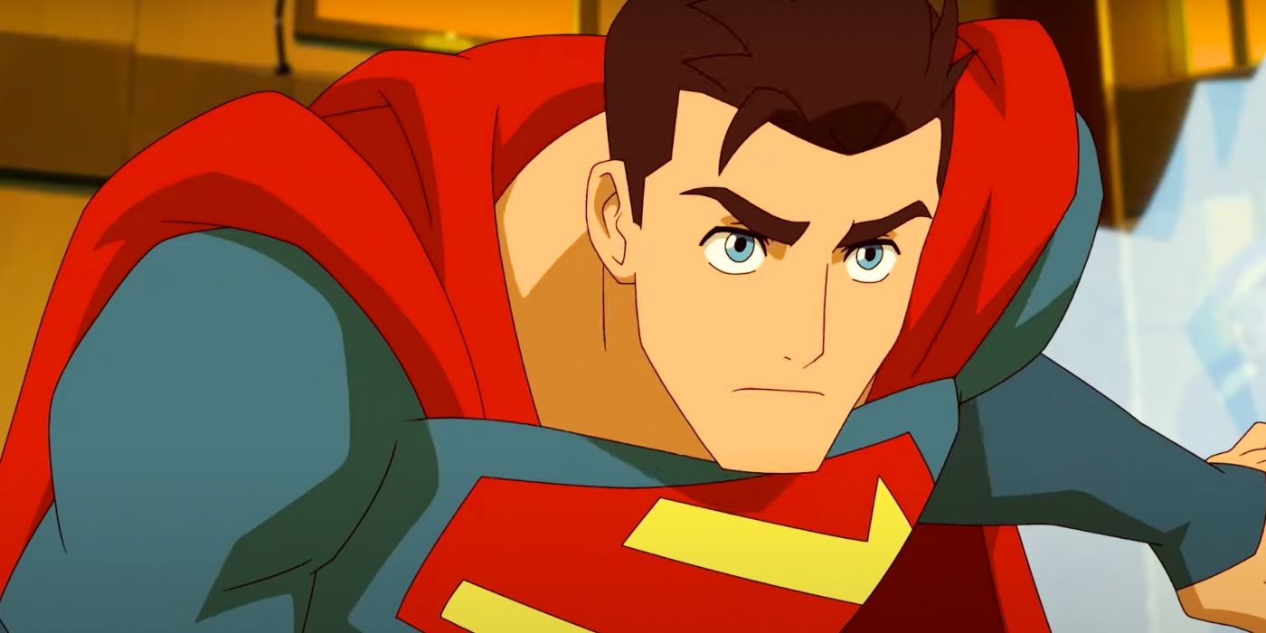
Beyond being more distinctive and alien in appearance, the new Superman logo also serves a practical purpose for the production team of My Adventures With Superman. Artist and character designer Kris Anka, who worked on both My Adventures With Superman and Spider-Man: Across The Spider-Verse, explained in a post on his personal Twitter that his primary goal had been making something simpler and streamlined, yet still recognizable as Superman’s logo. Curved lines are harder to animate cleanly than straight ones, so the straight-lined logo presented in My Adventures With Superman offered a symbol that animators could reproduce faster and more consistently.
While Kris Anka was successful in his goal of making “something fresh” for Superman’s reworked logo, he also created the perfect symbol of Superman’s duality. The new House of El logo is distinctively Superman, with the same familiar colors and diamond-cut shape. At the same time, it looks strange, like something from an alien world light years beyond Earth, physically and culturally. This makes it the perfect centerpiece to a Superman costume that is a balance between human ingenuity and alien practicality. It is also symbolic of how My Adventures With Superman remains true to the spirit of an American icon while presenting it through an anime aesthetic.
Source: screenrant.com
